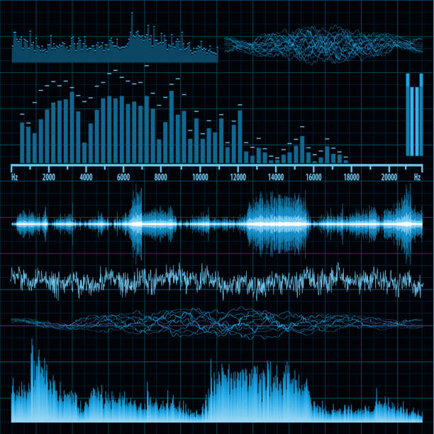
Choose music visualization if your goal is to visually represent data through dynamic and colorful animations. This technique can be particularly effective when used in conjunction with presentations or educational tools, capturing the audience’s attention through engaging graphics. Consider leveraging platforms like Processing or OpenGL, which offer robust frameworks for creating visually compelling representations that correlate data attributes with visual elements such as color, shape, or movement.
Prefer sonification when the auditory translation of data is required to uncover hidden patterns through sound. This approach excels in scenarios where perception speed is crucial, such as real-time monitoring systems or analyzing complex datasets over time. Utilize software like Pure Data or SuperCollider to transform data metrics into audio signals, allowing listeners to discern information through pitch, volume, and rhythm.
Combining both methods might offer dual benefits: visualization for immediate insights and sonification for detailed auditory analysis. Integrating visual and auditory components can enhance comprehension and provide a multifaceted understanding of data. Exploring the synergy between visualization and sonification could enrich data interpretation, offering a more comprehensive auditory and visual data narrative.
Music Visualization: Translating Data into Visual Experiences

Leverage the power of visual patterns to represent music by employing tools such as spectrograms and waveforms. Spectrograms transform sound frequencies into a visual format, enabling users to see distinct patterns and rhythms within a musical piece. This approach not only highlights the intricacies of sound but also allows for a deeper appreciation and analysis of musical composition.
Waveforms are another useful tool to visualize audio signals, as they depict changes in amplitude over time, offering insight into the dynamics and intensity of a track. They provide a straightforward method for identifying peaks and troughs, allowing listeners to anticipate changes in the music’s energy.
Experiment with engaging software like Processing or Pure Data, which offer flexibility in creating custom visualizations tailored to specific datasets. These platforms facilitate interactive experiences, encouraging users to connect visually with music in a more meaningful way.
Create immersive environments using visual programming tools such as Max/MSP, which can translate musical data into real-time visual representations. This paves the way for dynamic live performances where visuals respond instantaneously to musical changes, enhancing the audience’s sensory experience.
Consider integrating emerging technologies such as virtual reality and augmented reality, which provide novel contexts for music visualization. These technologies allow audiences to interact with and explore musical landscapes from a multi-dimensional perspective, thus enriching the overall experience.
Tools and Software for Creating Music Visualizations
Explore TouchDesigner, a powerful software for real-time music visualization. Ideal for both beginners and seasoned creators, it offers a node-based interface that simplifies the creation of complex visual effects synced with music. The tool integrates seamlessly with popular audio software like Ableton Live, allowing for dynamic visual representation of your sound layers.
For a more web-focused approach, consider using p5.js, a JavaScript library that connects coding and visual arts. This open-source platform enables users to craft intricate visualizations that respond to audio input, fostering real-time interactions on web pages. With a robust community, you can find countless examples and tutorials to expand your creative capabilities.
If desktop applications suit your needs better, Sonic Visualiser is a versatile option. It focuses on detailed audio analysis and can transform frequency data into striking visual patterns. This tool supports various plugins, extending its functionality to better match your specific project requirements.
Adobe After Effects remains a top choice for those favoring post-production visualization. Its rich set of plugins like Trapcode Sound Keys allows audio to directly influence animation parameters, creating stunning, synchronized visual effects. The user-friendly timeline enables precise control over every frame, ensuring your project perfectly reflects the music’s narrative.
Max/MSP provides a modular music visualization experience that encourages experimentation. By constructing custom patches, you can design visuals that react in real-time to live performances. The flexibility of this tool makes it suitable for installations and interactive art projects.
For enthusiasts of open-source solutions, Pure Data offers a free alternative to Max/MSP, supporting complex visual projects through its graphical programming interface. With community-driven extensions, Pure Data can visualize intricate sound patterns, making it a strong candidate for innovating experimental art.
Each of these tools has unique strengths, catering to different aspects of music visualization workflows. Choose based on your project demands and technical comfort, and unlock the full potential of your musical creativity.
Understanding the Role of Color, Shape, and Motion
Focus on using color to communicate different elements of music visualization meaningfully. Each hue can represent a specific aspect, like rhythm or tempo. For instance, rapid tempo might shine in bright yellow, while a slower beat might be encapsulated by deep blue tones. Use shapes to express various structures in the music. Angular shapes could mirror sharp, staccato notes, whereas flowing circles can characterize smooth, legato melodies.
Consider motion as an extension of rhythm. The movement speed and direction can reflect the pace and dynamics of a musical piece. For example, swirling motions might illustrate complex, layered compositions, while gentle oscillations can depict soothing harmonies. Integrate these elements cohesively to ensure the visualization captures the essence of the music, making it not just audibly appealing, but also visually engaging.
| Element | Music Aspect | Visualization Example |
|---|---|---|
| Color | Tempo | Bright yellow for fast tempo, deep blue for slow tempo |
| Shape | Note Structure | Angular for staccato, circles for legato |
| Motion | Rhythm Dynamics | Swirling for complex rhythms, oscillations for harmonies |
Combining these elements strategically enables more profound interaction with the music, rendering an immersive experience that stimulates both auditory and visual senses. The interplay of color, shape, and motion in music visualization helps decode the emotional layers and structural nuances, turning an auditory sensation into an encompassing multi-sensory journey.
Challenges in Mapping Data to Visual Elements
Prioritize clarity and understanding by selecting visual elements that accurately represent the data’s nature and scale. Data types, whether quantitative or qualitative, necessitate different visualization strategies. For instance, use bar charts for categorical data comparisons, while line graphs suit trend data over time. Select color schemes with consideration for color blindness and ensure adequate contrast to enhance interpretability.
Handling data granularity is another challenge. Aggregate complex data when necessary, but avoid oversimplification that might mislead interpretation. Consider interactive visualizations that allow users to explore data layers, such as detailed breakdowns via hover effects or zoom features, accommodating varying user preferences and comprehension levels.
Scalability poses difficulties in data visualization, especially with large datasets. Implement efficient algorithms for data processing and rendering, and consider using real-time data updates only when necessary. Optimize visual load times by limiting the initial data display, providing options to load more data progressively.
Integration of context and narrative enhances visualization impact. Craft a compelling story that guides the audience through the visual representation, using annotations and context cues to focus attention on key data points. Balance storytelling with the accuracy of data depiction to maintain viewer trust and engagement.
User Engagement and Immediate Interpretation through Visuals
Focus on enhancing user engagement by incorporating dynamic and intuitive visual elements. Begin with choosing easy-to-understand visuals that translate complex data into simple patterns. Users can quickly grasp trends without extensive analysis.
- Utilize color coding to distinguish different data sets. Colors help users differentiate between various musical elements instantly.
- Incorporate real-time updates to keep users engaged. Visuals that change in response to live data maintain interest and foster interaction.
- Include interactive elements such as sliders or buttons for users to manipulate data visualization. This hands-on approach encourages deeper exploration.
Ensure your visuals are accessible to all users, including those with color vision deficiencies. Rely on not just color, but also shape and texture differences.
Consider scalability of your visuals. They should maintain clarity and integrity when viewed on different devices. Responsive design is key, providing seamless interpretation on both large and small screens.
Select visualizations that align closely with the user’s musical experience. Synchronized visuals that match the tempo and mood of the music can heighten emotional connection and understanding.
Offer brief tutorials or tooltips that explain how to interpret visuals. Keep these explanations concise to avoid overwhelming the user, thus ensuring a smooth experience.
Through these techniques, users can effectively engage with music visualizations, enhancing both their auditory and visual experiences, leading to a more comprehensive understanding and enjoyment.
Sonification: Conveying Information through Sound
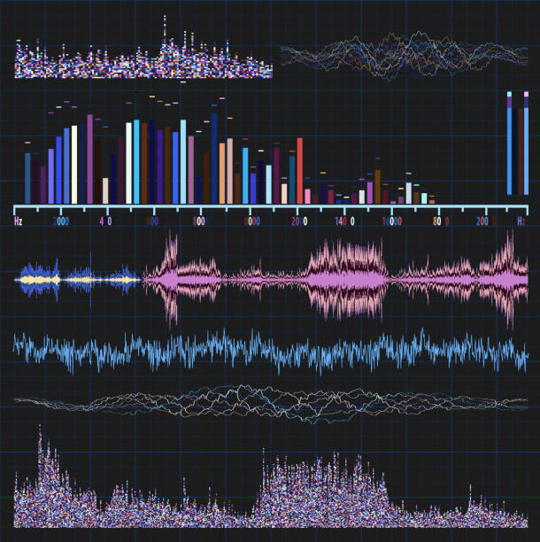
Leverage sonification to transform intricate data sets into audible narratives. Begin with identifying the data attributes you aim to represent, such as frequency, amplitude, or density, which can parallel auditory variables like pitch and volume. Use melodic mapping to reflect time sequences or trends, translating temporal shifts into rhythmic changes. This method is particularly effective for showing patterns in time-series data.
Integrate spatialization techniques to immerse listeners in a multidimensional data experience. By modeling the spatial properties of sound, you allow data points to be perceived from different angles, enriching understanding. This is especially useful for geospatial data or multi-dimensional analysis, where directionality and depth are key.
Ensure accessibility by crafting soundscapes that convey information intuitively. Prioritize clarity over complexity to prevent overwhelming the audience. Acknowledge the sensory limitations by keeping sound cues distinct and recognizable, avoiding excessive layers that might obscure meaning.
Adopt interactive sonification to enhance engagement through user-led exploration. Enable users to manipulate data characteristics and auditory outputs by providing interfaces that respond to inputs, offering a dynamic and personalized data interpretation journey.
Evaluate the emotional impact of sonification, recognizing the power of sound to influence mood and perception. Choose tonal and harmonic elements that align with the intended emotional response, enhancing the communicative power of the data. This approach is beneficial in areas like healthcare monitoring, where emotional resonance can enrich insight.
Test and iterate on sonification prototypes to refine audio mappings and usability. Gather feedback from a diverse user base to identify intuitive elements and areas for improvement. Conduct testing in real-world scenarios to ensure the sound representations meet the practical needs and expectations of the audience.
Expand your toolkit with software like Pure Data or Max/MSP, offering flexible environments for custom sonification design. These tools support a wide range of input data formats and provide robust frameworks to experiment with auditory variables.
By thoughtfully applying sonification strategies, you not only convey data but evoke an informative experience that is as insightful as it is auditory.
Basic Principles and Techniques of Sonification
Prioritize clarity by mapping data to sound properties such as pitch, volume, and timbre. Each element of data should correspond to a specific sound attribute, ensuring listeners can easily discern information. For example, a higher pitch can signify an increase in temperature, while a softer volume may indicate a decrease in stock value.
Employ real-time processing techniques to facilitate immediate auditory feedback. This method is particularly beneficial in dynamic environments like performance dashboards or exploratory data analysis, where quick insights are essential. Leverage frameworks like Pure Data or Max/MSP to enable interactive sonification designs that respond to user input or environmental changes.
Consider the aesthetic aspects of sonification by incorporating musical principles. Use harmony and rhythm to make the auditory display not only informative but also pleasing to the ear. Creating patterns or motifs from data streams can help listeners recognize trends or anomalies quickly.
Prioritize user experience by providing intuitive mappings that align with listeners’ existing auditory understanding. For instance, link rising data metrics with ascending scales, as this mapping naturally resonates with most people’s interpretation of ‘up’ and ‘increase’.
Involve end-users in the design process to tailor the sonification output to their specific needs and contexts. Conduct usability testing sessions to gather feedback and refine the mappings or sound choices. This participatory approach ensures that the sonification tool is both functional and user-friendly.
Finally, document the sonification process meticulously. Record the rationale for sound choices and mappings to facilitate future adjustments or expansions. Comprehensive documentation also supports reproducibility and aids in collaborative development efforts.
Applications in Science and Everyday Environments
Leverage music visualization and sonification to enhance scientific research by transforming complex datasets into auditory or visual experiences. Scientists routinely analyze large volumes of data, which can be overwhelming. Music visualization aids by offering a graphical representation of data, allowing researchers to identify patterns and anomalies more easily. For instance, in genomic studies, converting DNA sequences into musical notes helps researchers detect mutations and understand genetic variations faster and more intuitively.
Boost productivity in industrial settings by using sonification to monitor machinery and production processes. Sound alerts can quickly inform operators about equipment status, with different tones indicating variations in temperature, pressure, or speed. This can result in faster response times and reduced downtime, leading to significant cost savings.
Enhance educational experiences by integrating these techniques into learning modules. Music visualization can make abstract mathematical concepts more tangible for students by converting equations and graphs into dynamic visual patterns that captivate and engage learners. Sonification finds its place in teaching students with visual impairments, offering an alternative way to understand graphs and charts through auditory cues, thus ensuring an inclusive learning environment.
Apply these approaches to improve personal life quality by utilizing sonification in everyday ambient settings. For example, use sonification to create calming soundscapes that reflect weather patterns, providing a soothing background that can enhance mood and focus. In home automation, employ sound cues to notify inhabitants about daily schedules or environmental changes, making homes more responsive and interconnected.
Finally, enrich artistic performances with music visualization, where live data feeds drive visual displays. Musicians and performers can use real-time audience data, such as movement and sound, to alter the visuals, creating immersive and interactive experiences that captivate audiences and enrich the artistic expression.
Designing Sound Parameters for Accurate Data Representation
Choose sound parameters that correspond directly to the data attributes. For pitch, align it with quantitative data; higher values should have higher pitches, instantly conveying magnitude changes. Ensure the pitch range is comfortable for human hearing, typically between 20 Hz and 20 kHz, to facilitate clarity and accessibility.
Explore timbre to represent categorical data. Different instruments or synthesized sounds can effectively differentiate data categories. Customize timbre by adjusting harmonic content; this provides unique audio signatures without overwhelming the listener.
Leverage amplitude for dynamic insights. Varying volume levels can indicate data importance or significant variations. Cautiously adjust amplitude to maintain audibility and avoid listening fatigue. An optimized amplitude range reinforces data emphasis without distortion.
Implement rhythmic patterns to encode temporal data. Regular intervals can represent uniform time distributions, while irregular patterns highlight anomalies or peaks. Maintaining a consistent tempo within 60-120 BPM (beats per minute) aids engagement and comprehension.
Harmonize multiple sound elements for compounded data layers. Utilize complementary audio parameters to represent multi-dimensional data sets concurrently. This approach provides a richly textured auditory scene where each layer remains distinct, promoting intuitive data understanding.
Continuously iterate on your sound designs. Collect feedback from users to refine parameters, enhancing accuracy and assimilation. Prioritize user-centric modifications, ensuring soundscapes remain intuitive and enjoyable.
User Experience: Cognitive Load and Perceptual Considerations
Reduce cognitive load by simplifying your visualizations and sonifications. Select only the most crucial data points to represent. Overloading users with excessive information leads to confusion and disengagement.
- For music visualizations, keep designs clean and intuitive. Use contrasting colors and clear shapes to distinguish different data sets. Reserve complex animations for critical transitions or changes.
- In sonifications, prioritize clarity by selecting distinct auditory icons or motifs for different data categories. Avoid using overly complex musical structures that might overwhelm the listener.
Consider user perception by aligning visualization and sonification elements with natural human tendencies. Leverage familiar patterns and cultural associations to enhance comprehension.
- Utilize rising scales to represent increasing data trends, tapping into the universal association between pitch height and value growth.
- Align color choices in visualizations with common interpretations, such as red for caution or green for safety, to tap into subconscious recognition patterns.
Regularly gather user feedback to refine your approach. Conduct usability testing to identify points of confusion and adjust your designs accordingly. This proactive strategy ensures your data-to-music approach remains accessible and effective for a broad audience.
- Collect qualitative feedback through interviews or open-ended surveys to understand user sentiments.
- Analyze quantitative data from user interactions with the tool to identify patterns and bottlenecks in data interpretation.
By strategically reducing cognitive load and aligning with user perceptions, you create a more engaging and intuitive experience that empowers users to better interpret and interact with data through music.
Video:

Data Sonification: Beyond the Visual. Hearing data between science and emotion.
Data Sonification: Beyond the Visual. Hearing data between science and emotion.
Q&A:
What are the main differences between music visualization and sonification?
Music visualization is a process where music is transformed into visual graphics, allowing listeners to see a graphical representation of sound. It often enhances the emotional and aesthetic experience of music. In contrast, sonification involves converting data into musical forms or sound patterns to convey information. This approach is useful for analyzing data in a way that is intuitive through auditory perception rather than through numerical analysis.
How are music visualization techniques typically used?
Music visualization techniques are commonly used in multimedia presentations, live concerts, and music videos to provide an engaging experience that synchronizes with the audio. They can enhance the audience’s immersion and help portray the emotions or themes of the music through dynamic visuals.
Can sonification be used in scientific data analysis?
Yes, sonification can be particularly useful in scientific fields for analyzing complex data sets. By converting data points into sounds, researchers can detect patterns, trends, and anomalies that may not be immediately apparent when looking at raw numbers or graphs. This method can be applied in areas such as astronomy, seismology, and medical diagnostics.
Are there any examples of sonification in popular applications?
Sonification is often used in areas such as auditory feedback in user interfaces, where specific actions or events trigger sound cues, making the interaction more intuitive. In sports, it helps visualize player movements and game strategies through sound. Additionally, sonification is used creatively in art installations and experimental music compositions to create unique auditory experiences.
Does music visualization improve the experience of listening to music?
Many people find that music visualization enhances their listening experience by adding a visual element that complements the audio. This can be particularly effective in creating a more immersive environment, highlighting emotional nuances, and maintaining audience interest. However, personal preferences vary, and some listeners might prefer focusing on the music alone.
